Your FPL Season in One Big Graph
This chart shows your season in one big graph.
Enter your team ID in the box below, click ‘Create Season Graph’ and watch the magic unfold.
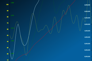
The yellow line shows your weekly gameweek scores.
The blue line shows your overall rank.
The pink line shows your gameweek rank for that week.
The green dotted line shows your team value.
The red line shows your overall accumulating score.
Hover over a point in the graph to see the values for each in that given gameweek.
If you like this, you might enjoy our other interactive FPL tools and charts here.
More interactive FPL tools and charts here.